[UPDATED to new naming conventions as of 0.0.11]
In the first two tutorials, Basic Plotting and Stacked Data Graphs, we were creating a single type of diagram. Sometimes we want to composite, or append together, multiple graphs. In Palyoplot we do this using palyoplot_appendGraphs().
First, let’s set up some graphs to see how this works. We’ll go ahead and use stacked diagrams for this example, but you can mix together any types of graphs (as long as each graph is saved in a unique R variable).
axis2 = palyoplot_get2ndAxis(interval=2, top=-20, bot=115, ages=pp_agemodel) #create double y-axis
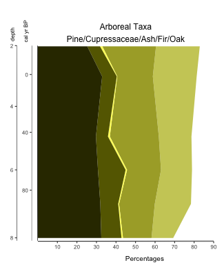
#tree plot
myTrees = pp_xdata[,1:5] #Just the tree taxa from our study
colorsTrees = c("#333300", "#666600", "#ffff66", "#aaaa33", "#cccc66")
gT = palyoplot_plotStackedTaxa(x=myTrees, y=pp_ydata, y2=axis2, y2.label=" depth",
title="Arboreal Taxa\nPine/Cupressaceae/Ash/Fir/Oak",
ylim=c(-20,115), y.label=" cal yr BP",
x.label="Percentages",
plot.style="area", colors=colors)
We’ve created a double y-axis (axis2) and saved our stacked Tree plot into the variable gT. That gives us the following…
Let’s create another stacked diagram of herbaceous types. Now, because we’re going to be appending this new graph onto the one above, we don’t really want another copy of our y-axis. We simply turn it off by setting y.show=FALSE. We’re going to store this graph into the variable gH.
myHerbs = pp_xdata[,8:9] #Just the herb taxa from our study
colorsHerbs = c("#009933", "#99ff99")
gH = palyoplot_plotStackedTaxa(x=myHerbs, y=pp_ydata, title="Herbs\nAster/Grass",
                               title.gpar = gpar(fontsize = 11),
                               ylim=c(-20,115), y.label="", x.label="",
                               plot.style="area", colors=colorsHerbs, y.show=FALSE)
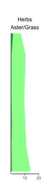
Notice I set the y.label and x.label arguments to empty, because the first we don’t need and the second we don’t want to show. I also changed the size of the title to 11pt from the default 12pt because the text was too large to fix over the plot.
Now that we have two graphs stored in two R variables, we can append gH to gT using palyoplot_appendGraphs(). We can set the overall height of the final graphic and set sub-widths (the width each plot should take up in the final graphic) to get the spacing just the way we want it.
gAppend = palyoplot_appendGraphs(arr=list(gT, gH), height=unit(16, "cm"), widths=unit(c(11,2.1), "cm"))
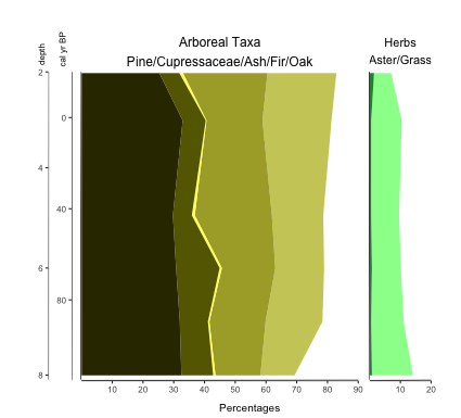
Now you don’t HAVE to use image editing software to put all your diagrams together. Palyoplot simplifies that part of your workflow! Append as many graphics together as you like! (just make sure to set the arguments for all of them)