[UPDATED to new naming conventions as of 0.0.16]
To get started, be sure to download an install the Palyoplot R library (during testing, the latest version Palyoplot is available here.
So you want to try out Palyplot and see how it works? Excellent, let’s dive in using the package’s built-in variables. Open up an R file (I suggest using R Studio if you aren’t already) and copy/paste the following:
library(palyoplot)
graph1 = palyoplot_plotTaxa(x=pp_xdata, y=pp_ydata, y.label="cal yr BP", x.label="Percentages")
You should get an output that looks something like this:
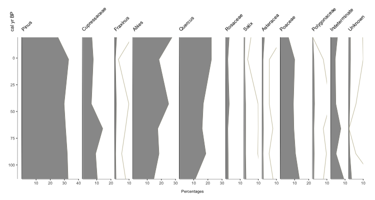
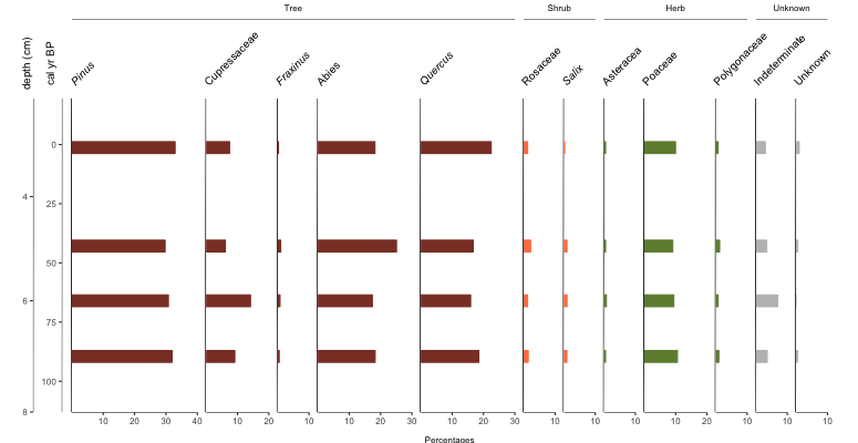
Your basic stratigraphic plot for Quaternary Science data (in this case, based on pollen). So what exactly did we do? pp_xdata contains our data for plotting, with the name of each taxa as the colname. pp_ydata contains information about our y-axis. pp_xdata and pp_ydata maintain their relationship through row numbers. The argument y.label is the label for our y-axis, and x.label is the label that spans all the x-axes for the plot.
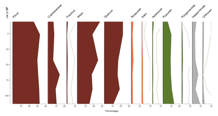
Kinda boring though, isn’t it? Lets jazz it up with some color! With Palyoplot you can assign individual colors to each taxa. The order of the colors in the list is the order they will be applied. Again, let’s use some built-in data via pp_colors. You can always explore the built-in datasets in R.
graph1 = palyoplot_plotTaxa(x=pp_xdata, y=pp_ydata, y.label="cal yr BP", x.label="Percentages", colors=pp_colors)
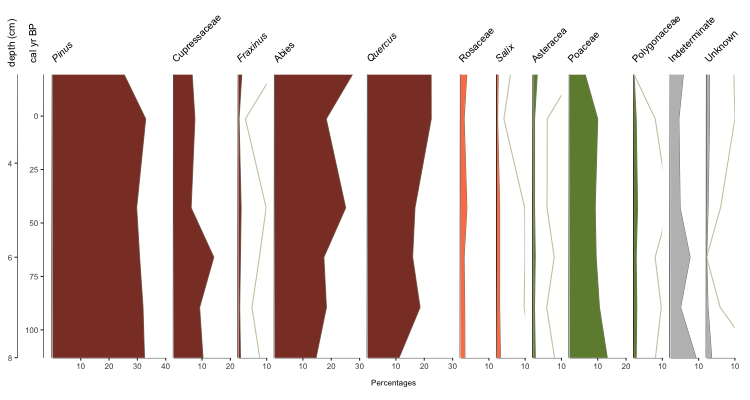
Much more eye-catching, no? But you may be thinking, ONE axis? What if I need to plot by TWO axes? I need to show both age AND depth, for instance. No problem! Simply supply a data.frame that shows the relationship. For instance, by reading in your BACON age model. For demonstration purposes, we’ll use pp_agemodel.
While we’re at it, let’s also fix the taxa names. Genus should be italicized, while family is plain. pp_fontStyles is a list that’s applied just like colors
axis2 = palyoplot_get2ndAxis(interval=2, top=-20, bot=115, ages=pp_agemodel)
graph1 = palyoplot_plotTaxa(x=pp_xdata, y=pp_ydata, y.label="cal yr BP",
                            x.label="Percentages", colors=pp_colors,
                            y2=axis2, y2.label="depth (cm)", plot.font.styles=pp_fontStyles)
palyoplot_get2ndAxis() builds the second y-axis based on your supplied interval (in the example above, every 2cm, with the starting (-20) and ending (115) relationship to your primary y-axis via explict data (pp_agemodel)) We then pass in that information as y2=axis2 and supply the 2nd axis’s label via y2.label=”depth (cm)”. We applied the font treatment using plot.font.styles=pp_fontStyles. Which gives us…
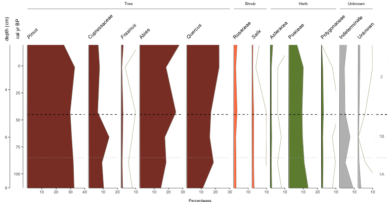
Okay, we’re getting there. You want more, don’t you? Alrighty, let’s throw on some group headings, show zone breaks, and label the zones.
#building custom zones
geom_zones = data.frame(c(115, 85, 45), #breaks in age. Need to start with the bottom value
                        c("blank", "dotted", "dashed"), #line type (style)
                        c("grey70", "grey70", "black"), #line color
                        c("1A", "1B", "2"), #section label
                        c("grey50", "grey50", "grey50"), #section label color
                        c(100, 65, 10), #section label placement (based on y-axis)
                        c(5, 5, 5) #offset (used to finetune placement)
                       )
colnames(geom_zones) = c("axisVal", "ltype", "lcolor", "annoText", "annoColor", "annoAxis", "axisOffset")
#plot
graph1 = palyoplot_plotTaxa(x=pp_xdata, y=pp_ydata, y.label="cal yr BP",
                            x.label="Percentages", colors=pp_colors, y2=axis2,
                            y2.label="depth (cm)", plot.font.styles=pp_fontStyles,
                            taxaGroups=pp_taxaGroups, zones=geom_zones)
pp_taxaGroups is a dataframe that references the name code from pp_lifeForms (not yet discussed), the count of how many of the (pre-sorted) taxa belong to that group, and the name to display on the plot. geom_zones we built above and the comments should be explanatory. Which now gives us…
Cool, but you know what? I wanted bars this whole time… plot.style=”bar”
Easy peasy.