[UPDATED to new naming conventions as of 0.0.11]
Sometimes you need a plot that shows the relationship between two variables. We typically do this via an index, using the common formula:
(Thing 1 – Thing 2) / (Thing 1 + Thing 2)
An index creates a range between -1 and 1. The more positive the number, the more of Thing 1, the more negative the number, the more of Thing 2. A value of 1 = 100% Thing 1 and -1 = 100% Thing 2.
To create an index plot in Palyoplot we use the function palyoplot_plotIndex(). We’re going to use and manipulate the built-in Palyoplot data. Let’s say we want to create an index for the relationship of Fir (Abies) vs. Oak (Quercus). We’re going to need to create a data variable in R using our built-in dataset pp_data, which has our raw taxa count data. Let’s save the index values into the variable xdata
xdata = (pp_data$Abies - pp_data$Quercus) / (pp_data$Abies + pp_data$Quercus)
Per our formula, positive numbers indicate more Fir and negative numbers indicate more Oak. Now that we have our variable, we can create our plot. Let’s continue our R code. We want the x-axis to be labeled every 0.1 ticks.
library("palyoplot")
botAge = 115; #max age to plot
topAge = -20; #min age to plot

g = palyoplot_plotIndex(x=xdata, y=pp_ydata, y.label="cal yr BP", ylim=c(topAge, botAge),
                        title="Oak/Fir\nIndex", x.label="Oak       Fir",
                        x.break=.1)
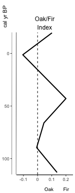
Hrm… the labels at the bottom of the x-axis aren’t aligned with the zeroline. We can adjust the placement using axis.title.x.hjust. While we’re at it, let’s also set the x-axis limits (xlim), change the y-axis breaks to every 20 years (y.break), and add on a secondary axis (y2) for depth (y2.label)
axis2 = palyoplot_get2ndAxis(interval=2, top=-20, bot=115, ages=pp_agemodel)

g = palyoplot_plotIndex(x=xdata, y=pp_ydata, y.label="cal yr BP", ylim=c(topAge, botAge),
                        title="Oak/Fir\nIndex", x.label="Oak       Fir",
                        x.break=.1, axis.title.x.hjust = 0.7,
                        xlim=c(-.15, .2),
                        y.break=20, y2=axis2, y2.label="  depth (cm)")
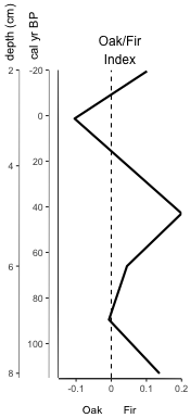
Better, but what if we want that index plot line to pop more? Say, make it thicker (line.lwd) and a color (color)? And we’re going to be appending it to the end of another plot later, so we don’t want the y-axis showing (y.show).
g = palyoplot_plotIndex(x=xdata, y=pp_ydata, y.label="cal yr BP", ylim=c(topAge, botAge),
                        title="Oak/Fir\nIndex", x.label="Oak       Fir",
                        axis.title.x.hjust = 0.7,
                        x.break=.1, xlim=c(-.15, .25),
                        y.show=FALSE, color="blue", plot.line.lwd=2)
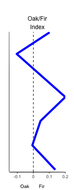
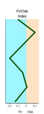
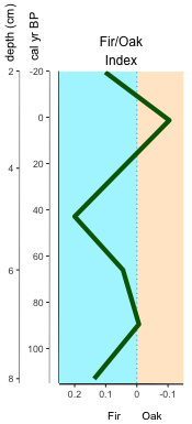
Better, but we want to really make the different sides of our graph pop to clearly show the difference in oak vs fir. We want the oak side of the zeroline (bg.neg.fill) to be orange-ish and the fir side (bg.pos.fill) to be blue-ish. But we don’t want the colors too bold, maybe a transparency (bg.neg.alpha, bg.pos.alpha) to soften the chroma? With the color-coded graph portions, we don’t even want the zeroline showing (zeroline=FALSE) because that’s just visual clutter now. We want the index line to be dark green (color) to go with the color-coding we’re using elsewhere in our presentation, and for consistency with how we’ve been presenting data in other parts of our presentation, we want negative values on the right and positive values on the left (a reversed x-axis (x.reverse=TRUE)). Is that level of customization even possible?!?? YUP! =D
g = palyoplot_plotIndex(x=xdata, y=pp_ydata, y.label="cal yr BP", ylim=c(topAge, botAge),
                        title="Fir/Oak\nIndex", x.label="Fir       Oak",
                        axis.title.x.hjust = 0.25,
                        x.break=.1, xlim=c(-.15, .25),
                        y.break=20, y2=axis2, y2.label="  depth (cm)",
                        y.show=FALSE, color="darkgreen", plot.line.lwd=2,
                        bg.neg.fill="bisque", bg.neg.alpha=.25,
                        bg.pos.fill="cadetblue1", bg.pos.alpha=.25,
                        x.reverse=TRUE, zeroline=FALSE)
Wow. Okay, what if I actually want that zeroline, but I don’t like the dashes (dots are so much better) and I think the zeroline should be grey and not black. No problem. Let’s go ahead and throw the double-axis back on for a complete visual aesthetic.
g = palyoplot_plotIndex(x=xdata, y=pp_ydata, y.label="cal yr BP", ylim=c(topAge, botAge),
                        title="Fir/Oak\nIndex", x.label="Fir       Oak",
                        axis.title.x.hjust = 0.25,
                        x.break=.1, xlim=c(-.15, .25),
                        y.break=20, y2=axis2, y2.label="  depth (cm)",
                        y.show=TRUE, color="darkgreen", plot.line.lwd=2,
                        bg.neg.fill="bisque", bg.neg.alpha=.25,
                        bg.pos.fill="cadetblue1", bg.pos.alpha=.25,
                        x.reverse=TRUE, zeroline.color="grey60",
                        zeroline.linetype="dotted")
Now you can get your index graphs visually stylized without being forced to break out the image-editing software!