[UPDATED to new naming conventions as of 0.0.11]
When visualizing Quaternary Science data, sometimes we want to stack related items in one graph. Case in point: pollen. Let’s say I wanted to explore the relationship between trees, shrubs, and herbs without losing the underlying information of the taxa inside those groups. You can do that with Palyoplot (caveat: you actually create multiple graphs that you append together to create the final image. That is for a later tutorial).
For this exercise, let’s create a stacked diagram of tree taxa using built-in Palyoplot datasets. In this case, we’re going to be manipulating pp_xdata (variable which contains taxa). Let’s go ahead and throw on a double y-axis while we’re at it.
library(palyoplot)
myData = pp_xdata[,1:5] #Just the tree taxa from our study
axis2 = palyoplot_get2ndAxis(interval=2, top=-15, bot=115, ages=pp_agemodel)
g = palyoplot_plotStackedTaxa(x=myData, y=pp_ydata, y2=axis2, y2.label=" depth",
                              title="Arboreal Taxa\nPine/Cupressaceae/Ash/Fir",
                              ylim=c(-20,115), y.label=" cal yr BP",
                              x.label="Percentages", plot.style="area")
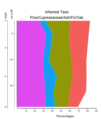
Colors are automatically selected from a colorwheel. It wouldn’t make much sense to default all the taxa as the same color, and the human eye can only distinguish well between 5 different shades. Too colorful you say? No worries, we can apply our own color scheme. For simplicity’s sake, I’m going to use hexadecimal color codes of 5 shades of olive brown (#333300, #666600, #999933, #aaaa33, #cccc66) to go along with our 5 taxa so you can see what’s happening in the backend (feel free to use R color ramps, palettes, etc to generate the codes).
colors = c("#333300", "#666600", "#999933", "#aaaa33", "#cccc66")
g = palyoplot_plotStackedTaxa(x=myData, y=pp_ydata, y2=axis2, y2.label=" depth",
                              title="Arboreal Taxa\nPine/Cupressaceae/Ash/Fir",
                              ylim=c(-20,115), y.label=" cal yr BP",
                              x.label="Percentages", plot.style="area", colors=colors)
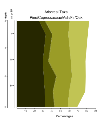
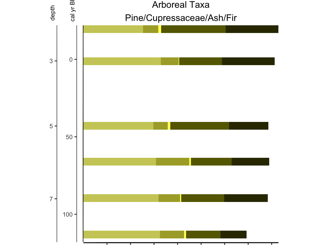
Hrmm… better, but it looks like only 4 colors when we have 5 taxa. Ash has low percentage values, so let’s have it pop a bit more.
colors = c("#333300", "#666600", "#ffff66", "#aaaa33", "#cccc66")
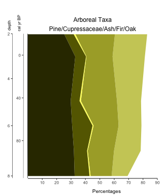
There, that’s better. Now we can see that indeed, there are 5 taxa, and that over the last 100 years arboreal (tree) taxa makes up roughly 80% of the total terrestrial pollen in the record.
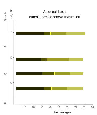
Right, so what if you want stacked bars instead? Set plot.style=”bar”
** note: if doing bars, expand your ylim values to allow for the bar width (ex: ylim=c(-22, 118))
Stacked lines? plot.style=”line”
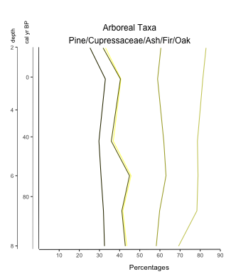
With Palyoplot it’s easy to switch between different graph styles!